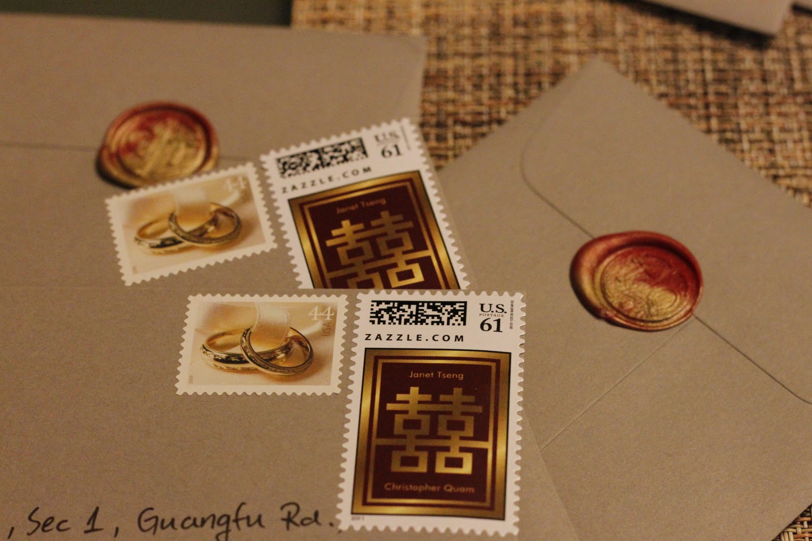
Many of our guests already got our invitation. It was quite a process to finally get everything together with an extra personal touch on it. I'm glad that most people are so kind to give me some positive feedback of those little extra effort - The Double Happiness stamp and the wax seal with our initials.
We had our invitation designed and printed via Diana Chou Designs. Flipping through all the samples that she has was quite a challenge since we had no color theme or styles in our mind. We knew the keywords - simple, elegant and contemporary and yet it's like telling people that "This wine has dark plum, smoke and cherry flavor with loads of meat and coffee notes." And you'll be like "WHAT??" So we just went with our instinct. We however did learn a lot about so many different color and font. Taupe, apricot, misty rose, pale egg blue,... Caslon, script, bickham, ... . You picked the shape, the design, the font, the color, ... Everything could be customized. It was a true test for two engineers. Again, the instinct and Diana's patience and suggestions guided us to what we have today. We were very happy when they arrived.

Initially we were just going to stuff in some direction info and then sent it out directly. However my Asian blood gradually kicked in. Fully western style, with all the English prints, this is far from what we used to know in terms of Chinese wedding invitation. They are supposed to be red and supposed to have a gigantic 囍 - double happiness, all over the place. The origin of this double happiness was from a poet, Wang Anshi in Northern Song Dynasty who got the good news of him gotten the first place of the Imperial Exam during his wedding ceremony. With two great things happening at the same time, the poet wrote two Chinese character - 喜 (happiness), next to each other on the door. Ever since then this is considered as a lucky sign in Chinese's wedding. The full version of the story could be found here in English and here in Chinese. I encourage you to read them since they are quite interesting. =)
To incorporate this lucky symbol, I found zazzle.com that let you customize your own stamps. Double happiness obviously is popular enough to have many styles for me to choose from. Of course they cost a little bit more than the stamp's face value. But I think people actually appreciate it when they saw them. =)

Next thing is direction sheets that we stuffed in. I'll spare you with the tedious detail of how I tried to find the Adobe Caslon Semi Bold Small Cap font to match our invitation font, also the translucent paper selection plus 10 different mock-up in terms of color and layout. They obviously doesn't look as professional but it's kinda cohesive in my mind.
Now the last step is to put everything together. The seal, where we got a lot of compliment for was the last personal touch after my horrible hand writing of all the names and addresses on the envelope. I had that idea a while ago when I was in a small paper store at Bridgeport mall. By the time we made up our mind to buy it, they ran out of letter "C". While last name initial works just as great and even better, here we have "Q" and "T" sealed on each invitation. Each seal requires 3 steps, dispense the wax with glue gun, ice the stamp, and then stamp on the wax and let it cool. 2:30AM in the morning, I powered through sealing all the invitations. Some might not survived through the post office's stamping machine which we should've requested hand-stamp only, but oh well, the invitation made it to your home safely and that's the most important thing. Now you see how much effort we put in, remember to RSVP!!! =)

Lastly, I'd like to thank our dear friend Teri and Noah for coming over to help out putting everything together. Well, Teri did the actual help while Noah helped keeping Chris company by playing video games. They always enjoy that extra bromance whenever they could.

No comments:
Post a Comment